


Introduction
This project will make you enjoy the solar system like never before. The solar system that is animated in a mesmerizing way by the use of HTML, CSS and JavaScript. With this, planets can be seen orbiting around the Sun, studious look at their details and interactive travels within our celestial neighborhood. An aesthetic- scientific-coding-fusion makes this happen on your web browser bringing cosmos to your fingertips. Time to get started with our cosmic adventure!
Processes in Development of 9 Planets Animated System
Creating a 9-planets animated solar system using HTML, CSS, and JavaScript involves building a web-based simulation that visually represents the planets in our solar system and animates their orbits. Below, I’ll provide a high-level overview of how you can create such a project:
- HTML Structure: Start by setting up the basic HTML structure for your project. Create a container for the solar system and individual elements for each planet. You can use HTML elements like
<div>or<canvas>for this purpose. - CSS Styling: Use CSS to style the elements and make them look like planets. You’ll need to define the size, colors, and textures (if desired) for each planet. You can also use CSS animations for any planet-specific animations, like rotating.
- JavaScript Logic: JavaScript will be the backbone of your animation. You’ll need to write JavaScript code to handle the following aspects:
- Orbit Calculation: Calculate the positions of the planets based on their orbital parameters (distance from the Sun, orbital period, eccentricity, etc.). You can use Kepler’s laws or simplified equations for this purpose.
- Animation Loop: Create an animation loop using
requestAnimationFrame()or a similar method to continuously update the positions of the planets and simulate their orbits. - Planet Movement: Update the position of each planet based on its orbital parameters in each frame of the animation loop. You’ll need to use trigonometric functions to calculate their positions.
- Documentation: Consider documenting your project well, especially if you plan to share it with others. Provide explanations of how the simulation works and how others can use or modify it.
- Publishing: Once your project is complete, you can publish it on a web hosting platform or share it on a code-sharing platform like GitHub so that others can see and interact with your animated solar system.
Remember that creating a realistic solar system simulation with accurate orbital parameters can be quite complex, but it’s a great way to learn about web development and physics.
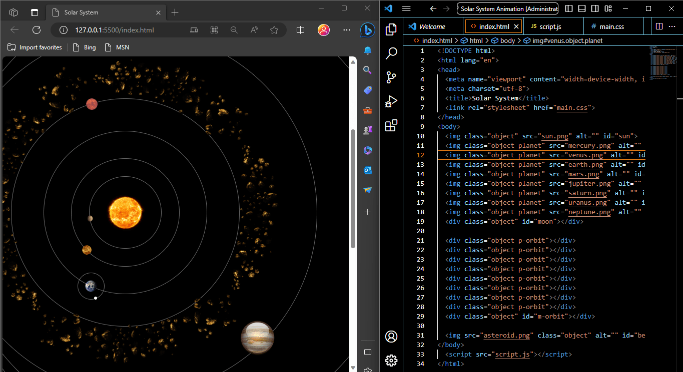
Html Code File (index.html)
This HTML code is a basic structure for creating a webpage that simulates a solar system animation using HTML, CSS, and JavaScript.
<!DOCTYPE html>
<html lang="en">
<head>
  <meta name="viewport" content="width=device-width, initial-scale=1, shrink-to-fit=no">
  <meta charset="utf-8">
  <title>Solar System</title>
  <link rel="stylesheet" href="style.css">
</head>
<body>

  <img class="object" src="sun.png" alt="" id="sun">
  <img class="object planet" src="mercury.png" alt="" id="mercury">
  <img class="object planet" src="venus.png" alt="" id="venus">
  <img class="object planet" src="earth.png" alt="" id="earth">
  <img class="object planet" src="mars.png" alt="" id="mars">
  <img class="object planet" src="jupiter.png" alt="" id="jupiter">
  <img class="object planet" src="saturn.png" alt="" id="saturn">
  <img class="object planet" src="uranus.png" alt="" id="uranus">
  <img class="object planet" src="neptune.png" alt="" id="neptune">
  <div class="object" id="moon"></div>

  <div class="object p-orbit"></div>
  <div class="object p-orbit"></div>
  <div class="object p-orbit"></div>
  <div class="object p-orbit"></div>
  <div class="object p-orbit"></div>
  <div class="object p-orbit"></div>
  <div class="object p-orbit"></div>
  <div class="object p-orbit"></div>
  <div class="object" id="m-orbit"></div>

  <img src="asteroid.png" class="object" alt="" id="belt">
</body>

  <script src="script.js"></script>
</html>
Let’s break down the code step by step:
<!DOCTYPE html>: This is the document type declaration, which tells the browser that the document is an HTML5 document.<html lang="en">: This is the opening<html>tag, and it specifies that the document is in English (the “en” attribute). It’s the root element of the HTML document.<head>: This is the head section of the document, where you include metadata and links to external resources. It doesn’t contain visible content for the webpage.<meta name="viewport" content="width=device-width, initial-scale=1, shrink-to-fit=no">: This<meta>tag sets the viewport properties, ensuring that the webpage adapts to the device’s width and scale. It’s essential for creating a responsive design.<meta charset="utf-8">: This<meta>tag specifies the character encoding for the document, which is set to UTF-8, a widely used character encoding for handling various character sets.<title>Solar System</title>: This<title>tag sets the title of the webpage, which is displayed in the browser’s title bar or tab.<link rel="stylesheet" href="main.css">: This<link>tag links an external CSS (Cascading Style Sheet) file named “main.css” to the HTML document. It’s used to apply styles to the webpage.
<body>: This is the body section of the document, where the visible content of the webpage resides.<img>: These are a series of<img>tags that represent images of celestial bodies (e.g., the Sun, planets, and an asteroid) that are part of the solar system animation. Each image has aclassattribute for styling purposes and anidattribute to uniquely identify it. Thesrcattribute specifies the image file to be displayed, and thealtattribute provides alternative text for accessibility.<div>: These are<div>elements with various classes (object,p-orbit,m-orbit) and anidattribute (moon). These are used to create div elements for styling and positioning elements in the animation.<script src="script.js"></script>: This<script>tag links an external JavaScript file named “script.js” to the HTML document. It’s used to provide the functionality and interactivity for the solar system animation.
CSS Code File (style.css)
This CSS code is used to style the elements of a solar system animation.
body {
    background: black;
    margin: 0;
    padding: 0;
    height: 200vmin;
  }

  .object {
    border-radius: 50%;
    position: absolute;
    margin: auto;
    top: 0;
    left: 0;
    right: 0;
    bottom: 0;
    transform: translateY( 50vmin );
  }

  .p-orbit, #m-orbit{
    border: 0.1vmin solid lightgrey;
    opacity: 0.5;
    background: transparent;
  }

  #belt {
    height: 97vmin;
    width: 97vmin;
    animation: spin 50s infinite linear;
    margin-top: 50vmin;
  }

  @keyframes spin{
    0%{ transform: rotate(0deg) }
    100%{ transform: rotate(360deg) }
  }

  #m-orbit {
    height: 8vmin;
    width: 8vmin;
  }

  .planet, #moon {
    z-index: 100;
  }

  #sun {
    height: 12vmin;
    width: 12vmin;
  }

  #moon {
    height: 1vmin;
    width: 1vmin;
    background-color: white;
  }

  #mercury {
    height: 2vmin;
    width: 2vmin;
  }

  #venus {
    height: 3vmin;
    width: 3vmin;
  }

  #earth {
    height: 4vmin;
    width: 4vmin;
  }

  #mars {
    height: 3.5vmin;
    width: 3.5vmin;
  }

  #jupiter {
    height: 12vmin;
    width: 12vmin;
  }

  #saturn {
    height: 12vmin;
    width: 12vmin;
    border-radius: 0%;
  }

  #uranus {
    height: 5vmin;
    width: 5vmin;
  }

  #neptune {
    height: 4vmin;
    width: 4vmin;
  }
Let’s break down the code step by step:
body: This selector styles the<body>element, which represents the entire webpage’s content.background: black;: Sets the background color of the webpage to black.margin: 0; padding: 0;: Removes any default margins and padding from the<body>element.height: 200vmin;: Sets the height of the<body>element to 200vmin. Thevminunit represents the smaller of the viewport’s width and height, so this makes the height responsive to the viewport size.
.object: This selector styles elements with the class.object. These elements are used for various celestial bodies in the solar system animation.border-radius: 50%;: Gives these elements a circular shape by setting a 50% border radius.position: absolute;: Positions the elements absolutely within their containing element.margin: auto;: Centers the elements horizontally by setting margin to auto.top: 0; left: 0; right: 0; bottom: 0;: Centers the elements vertically and horizontally using top, left, right, and bottom properties.transform: translateY(50vmin);: Translates the elements vertically by 50vmin units, which helps position them appropriately within the viewport.
.p-orbit, #m-orbit: This selector styles elements with the class.p-orbitand the element with the id#m-orbit. These elements represent the planetary orbits.border: 0.1vmin solid lightgrey;: Sets a light grey solid border with a thickness of 0.1vmin.opacity: 0.5;: Reduces the opacity of these elements to 50%, making them partially transparent.background: transparent;: Sets the background of these elements to transparent.
#belt: This selector styles the element with the id#belt, which represents the asteroid belt.height: 97vmin; width: 97vmin;: Sets the height and width of the asteroid belt to 97vmin units, making it responsive to the viewport size.animation: spin 50s infinite linear;: Applies a CSS animation named “spin” to rotate the asteroid belt over 50 seconds infinitely in a linear fashion.margin-top: 50vmin;: Adds a top margin of 50vmin units to vertically position the asteroid belt.
@keyframes spin: This is a keyframes animation named “spin” that defines how the asteroid belt rotates.0% { transform: rotate(0deg) }: At 0% of the animation, the asteroid belt starts with no rotation.100% { transform: rotate(360deg) }: At 100% of the animation, the asteroid belt completes a full 360-degree rotation.
#m-orbit: This selector styles the element with the id#m-orbit, which represents the moon’s orbit.height: 8vmin; width: 8vmin;: Sets the height and width of the moon’s orbit to 8vmin units.
.planet, #moon: This selector styles elements with the class.planetand the element with the id#moon, representing planets and the moon.z-index: 100;: Sets the z-index to 100, ensuring that these elements appear above other elements in the stacking order.
- ID selectors (e.g.,
#sun,#mercury,#venus, etc.): These selectors style individual celestial bodies, including the Sun and planets, by specifying their respective IDs.heightandwidthproperties set the height and width of each celestial body.- For Saturn, there’s an additional
border-radiusproperty that sets the border-radius to 0%, making it appear as a circle. - For the moon (
#moon), there’s abackground-colorproperty that sets its background color to white.
Overall, this CSS code provides the styling for the solar system animation, including background colors, sizes, positions, borders, and animations for various celestial bodies and their orbits.
Javascript Code file (script.js)
This JavaScript code is responsible for animating a solar system simulation on a webpage.
const planets = document.querySelectorAll('.planet')
const p_radii = [22,33,50,70,112,138,165,190]
let p_radians = new Array(8).fill(0)
const p_velocities = [1.607, 1.174,1,0.802, 0.434, 0.323, 0.228, 0.182]

const moon = document.querySelector('#moon')
const m_radius = 8
let m_radians = 0
const m_velocity = 10

const p_orbits = document.querySelectorAll('.p-orbit')
const m_orbit = document.querySelector('#m-orbit')

p_orbits.forEach((p_orbit, index)=>{
  p_orbit.style.height = `${p_radii[index]}vmin`
  p_orbit.style.width = `${p_radii[index]}vmin`
})

setInterval( ()=> {
  planets.forEach( (planet, index)=>{
    planet.style.left = `${Math.cos(p_radians[index]) * p_radii[index]}vmin`
    planet.style.top = `${Math.sin(p_radians[index]) * p_radii[index]}vmin`
    p_radians[index] += p_velocities[index] * 0.02
  })

  moon.style.left = `${earthX() + (Math.cos(m_radians) * m_radius )}vmin`
  moon.style.top = `${earthY() + (Math.sin(m_radians) * m_radius )}vmin`
  m_radians += m_velocity * 0.02

  m_orbit.style.left = `${earthX()}vmin`
  m_orbit.style.top = `${earthY()}vmin`
}, 1000/60)

function earthX(){
  return Number( planets[2].style.left.split('vmin')[0] )
}

function earthY(){
  return Number( planets[2].style.top.split('vmin')[0] )
}
Let’s break it down step by step:
const planets = document.querySelectorAll('.planet'):- This line selects all elements with the class
planetand stores them in theplanetsvariable. - These elements represent the planets in the solar system.
- This line selects all elements with the class
const p_radii = [22, 33, 50, 70, 112, 138, 165, 190]:- An array
p_radiiis defined, containing the radii (distances from the center) for the planetary orbits invminunits.
- An array
let p_radians = new Array(8).fill(0):- An array
p_radiansis initialized with eight values, all set to 0. - This array will store the current angles of rotation for each planet.
- An array
const p_velocities = [1.607, 1.174, 1, 0.802, 0.434, 0.323, 0.228, 0.182]:- An array
p_velocitiesis defined, containing the angular velocities for the planets.
- An array
const moon = document.querySelector('#moon'):- This line selects the element with the ID
moonand stores it in themoonvariable. - This element represents the moon in the solar system.
- This line selects the element with the ID
const m_radius = 8:- The variable
m_radiusis set to 8, representing the distance of the moon from the Earth.
- The variable
let m_radians = 0:- The variable
m_radiansis initialized to 0. - This variable will store the current angle of rotation for the moon.
- The variable
const m_velocity = 10:- The variable
m_velocityis set to 10, representing the angular velocity of the moon.
- The variable
const p_orbits = document.querySelectorAll('.p-orbit'):- This line selects all elements with the class
p-orbitand stores them in thep_orbitsvariable. - These elements represent the orbits of the planets.
- This line selects all elements with the class
const m_orbit = document.querySelector('#m-orbit'):- This line selects the element with the ID
m-orbitand stores it in them_orbitvariable. - This element represents the orbit of the moon.
- This line selects the element with the ID
p_orbits.forEach((p_orbit, index) => { ... }):- This loop iterates through each element in the
p_orbitsarray (planet orbits). - For each element, it sets the
heightandwidthstyles to match the respective radius from thep_radiiarray.
- This loop iterates through each element in the
setInterval(() => { ... }, 1000/60):- This sets up a repeating interval using
setIntervalwith a function that executes every 16.67 milliseconds (approximately 60 frames per second).
- This sets up a repeating interval using
planets.forEach((planet, index) => { ... }):- This loop iterates through the
planetsarray (planet elements) and updates their positions. - It calculates the new
leftandtopstyles for each planet based on the current angle (p_radians) and radius (p_radii) to simulate their orbital motion. - The angles are incremented by the corresponding angular velocities from
p_velocities.
- This loop iterates through the
moon.style.leftandmoon.style.top:- These lines update the position of the moon element based on its angle (
m_radians) and radius (m_radius) relative to the Earth’s position.
- These lines update the position of the moon element based on its angle (
m_radiansis incremented bym_velocityto simulate the moon’s rotation.m_orbit.style.leftandm_orbit.style.top:- These lines update the position of the moon’s orbit to match the Earth’s position.
- Finally, two functions,
earthX()andearthY(), are defined to calculate the X and Y coordinates of Earth (the third planet in theplanetsarray) to position the moon relative to it.
To put it briefly, this JavaScript code is a simulation of a solar system that animates its planets and moon through continuous updating of their positions relative to angles, radii and velocities; also it updates orbits’ positions as well as keeps animation speed about 60 frames per second.
Images Zip File with All Codes
Download Full Project
Resource ready for free download! Sign up with your email to get instant access.In these two code snippets for HTML and CSS files images are called up by using img html elements. These pictures show celestial bodies or objects in simulation of solar system. However, your code doesn’t contain any image files themselves; it only gives paths for these images using the src attribute inside the <img> tags.
Here are the image references in the HTML code:
<img class="object" src="sun.png" alt="" id="sun">
<img class="object planet" src="mercury.png" alt="" id="mercury">
<img class="object planet" src="venus.png" alt="" id="venus">
<img class="object planet" src="earth.png" alt="" id="earth">
<img class="object planet" src="mars.png" alt="" id="mars">
<img class="object planet" src="jupiter.png" alt="" id="jupiter">
<img class="object planet" src="saturn.png" alt="" id="saturn">
<img class="object planet" src="uranus.png" alt="" id="uranus">
<img class="object planet" src="neptune.png" alt="" id="neptune">
<img src="asteroid.png" class="object" alt="" id="belt">
In this code, each <img> element has a src attribute that specifies the path to the image file to be displayed. For example, "sun.png" refers to an image file named “sun.png,” and "mercury.png" refers to an image file named “mercury.png.”
Either in a directory specified by the relative path after src attribute or same folder as html file these images should exist when loading them through <img>. These images are used to visually represent the Sun, planets, and an asteroid in the solar system simulation when the webpage is loaded and displayed in a web browser.