


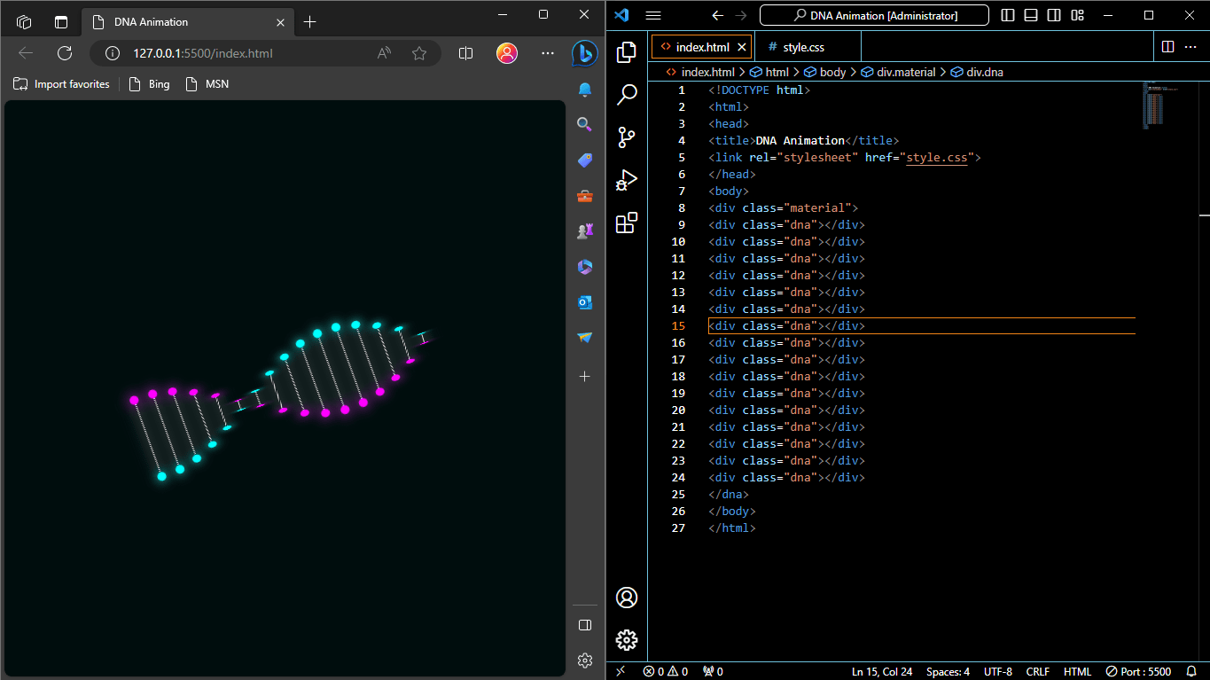
The “DNA Animation” using HTML and CSS is a web animation that visually simulates the structure of DNA (deoxyribonucleic acid) using HTML and CSS. DNA is a molecule that carries genetic information in living organisms, and its structure is typically depicted as a double helix composed of two long chains of nucleotides.
Key Components of DNA Animation Project
Here’s a breakdown of the key components in the code:
- HTML Structure:
- The HTML structure contains a
<div>with the class “material,” which serves as a container for the DNA animation. - Inside this container, there are multiple
<div>elements with the class “dna.” Each of these represents one vertical line of the DNA structure.
- The HTML structure contains a
- CSS Styles:
- The CSS styles define the appearance and animation of the DNA structure.
- The “dna” class is used to style each vertical line. It gives them a dotted appearance and adds a shadow for a 3D effect.
- The “::before” and “::after” pseudo-elements are used to create top and bottom dots on each line, representing the nitrogenous bases.
- The
@keyframesanimation named “rotate” is defined to continuously rotate the DNA structure around the X-axis, giving it a spinning effect. - The animation-delay property is used to stagger the start times of the animations for each vertical line, creating a cascading effect.
When you view this code in a web browser, you’ll see a visually appealing animation that simulates the twisting and rotating of a DNA double helix, with colorful dots representing the base pairs. This kind of animation is often used for educational purposes or as a decorative element on websites related to genetics or biology.
In this animation, the DNA structure is represented as a series of vertical lines (the “dna” class) with two colored dots (representing nitrogenous bases) on each line. The animation rotates the DNA structure continuously to create a dynamic and visually engaging effect.
Html Code
<!DOCTYPE html>
<html>
<head>
<title>DNA Animation</title>
<link rel="stylesheet" href="style.css">
</head>
<body>
<div class="material">
<div class="dna"></div>
<div class="dna"></div>
<div class="dna"></div>
<div class="dna"></div>
<div class="dna"></div>
<div class="dna"></div>
<div class="dna"></div>
<div class="dna"></div>
<div class="dna"></div>
<div class="dna"></div>
<div class="dna"></div>
<div class="dna"></div>
<div class="dna"></div>
<div class="dna"></div>
<div class="dna"></div>
<div class="dna"></div>
</dna>
</body>
</html>
Let’s break down the provided DNA animation Html code step by step with headings for clarity.
HTML Structure
<!DOCTYPE html>
<html>
<head>
  <title>DNA Animation</title>
  <link rel="stylesheet" href="style.css">
</head>
<body>
  <div class="material">
    <!-- Multiple "dna" Div Elements -->
  </div>
</body>
</html>
Document Structure
<!DOCTYPE html>: Declares the document type as HTML5.<html>: The root element of the HTML document.
Head Section
<head>: Contains metadata and links to external resources.<title>: Sets the title of the web page to “DNA Animation.”<link rel="stylesheet" href="style.css">: Links an external CSS file named “style.css” to apply styles to the HTML content.
Body Section
<body>: Contains the visible content of the web page.<div class="material">: A container for the DNA animation.
CSS Code
* {
margin: 0;
padding: 0;
box-sizing: border-box;
}

body {
background: #000d0d;
display: flex;
justify-content: center;
align-items: center;
height: 100vh;
}

.material {
position: relative;
display: flex;
justify-content: center;
align-items: center;
transform-style: preserve-3d;
transform: rotateZ(-20deg);
}

@keyframes rotate {
0% {
transform: rotateX(0deg);
}
100% {
transform: rotateX(360deg);
}
}

.dna {/*line*/
    position: relative;
    width: 1px;
    height: 100px;
    border: 1px dotted #e7e7e7;
    box-shadow: 0 0 15px #e7e7e7;
    background: transparent;
    margin: 0px 10px;
    animation: rotate 3s linear infinite;
}

.dna::before {/*top dot*/
    content: "";
    position: absolute;
    top: -2px;
    left: -5px;
    width: 10px;
    height: 10px;
    background: #ff00ff;
    border-radius: 50%;
    box-shadow: 0 0 15px #ff00ff;
}


.dna::after {/*bottom dot*/
content: '';
position: absolute;
bottom: -2px;
left: -5px;
width: 10px;
height: 10px;
background: #0ff;
border-radius: 50%;
box-shadow: 0 0 12px #0ff;
}

.dna:nth-child(1) {
animation-delay: -0.15s;
}
.dna:nth-child(2) {
animation-delay: -0.3s;
}
.dna:nth-child(3) {
animation-delay: -0.45s;
}
.dna:nth-child(4) {
animation-delay: -0.6s;
}
.dna:nth-child(5) {
animation-delay: -0.75s;
}
.dna:nth-child(6) {
animation-delay: -0.9s;
}
.dna:nth-child(7) {
animation-delay: -1.05s;
}
.dna:nth-child(8) {
    animation-delay: -1.2s;
}
.dna:nth-child(9) {
    animation-delay: -1.35s;
    }
.dna:nth-child(10) {
    animation-delay: -1.5s;
}
.dna:nth-child(11) {
    animation-delay: -1.65s;
}
.dna:nth-child(12) {
    animation-delay: -1.8s;
}
.dna:nth-child(13) {
    animation-delay: -1.95s;
}
.dna:nth-child(14) {
    animation-delay: -2.1s;
}
.dna:nth-child(15) {
    animation-delay: -2.25s;
}
.dna:nth-child(16) {
    animation-delay: -2.4s;
}
Let’s break down the provided DNA animation CSS code step by step with headings for clarity.
Download Full DNA Project
Resource ready for free download! Sign up with your email to get instant access.CSS Styles
* {
  margin: 0;
  padding: 0;
  box-sizing: border-box;
}

body {
  background: #000d0d;
  display: flex;
  justify-content: center;
  align-items: center;
  height: 100vh;
}
Reset Styles
*: Targets all elements on the page.margin: 0; padding: 0;: Sets margin and padding to zero, resetting default spacing.box-sizing: border-box;: Ensures that padding and border are included in the element’s total width and height.
Body Styles
body: Styles applied to the entire page body.background: #000d0d;: Sets the background color to dark blue.display: flex;: Uses flexbox for layout.justify-content: center;: Centers content horizontally.align-items: center;: Centers content vertically.height: 100vh;: Sets the body height to 100% of the viewport height.
DNA Animation Container
.material {
  position: relative;
  display: flex;
  justify-content: center;
  align-items: center;
  transform-style: preserve-3d;
  transform: rotateZ(-20deg);
}
Container Styles
.material: Styles applied to the DNA animation container.position: relative;: Positioning context for child elements.display: flex;: Uses flexbox for layout.justify-content: center;: Centers content horizontally.align-items: center;: Centers content vertically.transform-style: preserve-3d;: Preserves 3D transformations.transform: rotateZ(-20deg);: Rotates the container around the Z-axis by -20 degrees for a tilted effect.
Keyframe Animation
@keyframes rotate {
  0% {
    transform: rotateX(0deg);
  }
  100% {
    transform: rotateX(360deg);
  }
}
Animation Definition
@keyframes rotate: Defines a keyframe animation named “rotate.”0%: Starting keyframe.transform: rotateX(0deg);: No rotation at the beginning.
100%: Ending keyframe.transform: rotateX(360deg);: Rotates 360 degrees around the X-axis at the end.
This animation continuously rotates elements along the X-axis, creating a spinning effect.
DNA Line Styles
.dna {
  /*line*/
  position: relative;
  width: 1px;
  height: 100px;
  border: 1px dotted #e7e7e7;
  box-shadow: 0 0 15px #e7e7e7;
  background: transparent;
  margin: 0px 10px;
  animation: rotate 3s linear infinite;
}
DNA Line Styles
.dna: Styles applied to each vertical line representing a part of the DNA structure.position: relative;: Positioning context for pseudo-elements.width: 1px;: Sets a very thin width.height: 100px;: Sets a height of 100 pixels.border: 1px dotted #e7e7e7;: Adds a 1-pixel dotted border.box-shadow: 0 0 15px #e7e7e7;: Adds a shadow for a 3D effect.background: transparent;: Sets a transparent background.margin: 0px 10px;: Adds horizontal margin to space out the lines.animation: rotate 3s linear infinite;: Applies the “rotate” animation to spin the line around the X-axis.
Top Dot (Pseudo-element)
.dna::before {
  /*top dot*/
  content: "";
  position: absolute;
  top: -2px;
  left: -5px;
  width: 10px;
  height: 10px;
  background: #ff00ff;
  border-radius: 50%;
  box-shadow: 0 0 15px #ff00ff;
}.dna::before: Creates the top dot (representing a nitrogenous base) on each DNA line using a pseudo-element.content: "";: Provides an empty content area for the pseudo-element.position: absolute;: Positions the dot absolutely within the parent.dnaelement.top: -2px;: Shifts the dot 2 pixels above the top edge of the line.left: -5px;: Shifts the dot 5 pixels to the left of the line.width: 10px;: Sets the dot’s width to 10 pixels.height: 10px;: Sets the dot’s height to 10 pixels.background: #ff00ff;: Gives the dot a pink color.border-radius: 50%;: Rounds the dot to create a circular shape.box-shadow: 0 0 15px #ff00ff;: Adds a shadow for a 3D effect.
Bottom Dot (Pseudo-element)
.dna::after {
  /*bottom dot*/
  content: '';
  position: absolute;
  bottom: -2px;
  left: -5px;
  width: 10px;
  height: 10px;
  background: #0ff;
  border-radius: 50%;
  box-shadow: 0 0 12px #0ff;
}.dna::after: Creates the bottom dot (representing another nitrogenous base) on each DNA line using a pseudo-element. The properties are similar to the top dot but with different colors and positions.
Animation Delays
.dna:nth-child(1) {
  animation-delay: -0.15s;
}

.dna:nth

-child(2) {
  animation-delay: -0.3s;
}

/* ... More nth-child rules for animation delays */- These rules apply animation delays to individual
.dnaelements to stagger their rotations and create a cascading effect. Eachnth-childrule specifies a unique animation delay for different DNA lines.
Summary
This code creates a visually appealing DNA animation using HTML and CSS. It starts with an HTML structure that includes a container for the animation and links to an external CSS file. The CSS code defines styles for the entire page, the DNA animation container, keyframe animations, DNA lines, and top and bottom dots representing nitrogenous bases. Animation delays are used to create a cascading effect, making the DNA lines appear to rotate in a spinning motion.
Please note that the actual CSS styles for colors and other visual aspects are missing in the provided code, as indicated by comments (/* ... */). These styles should be defined in the linked “style.css” file to complete the visual representation of the DNA animation.