


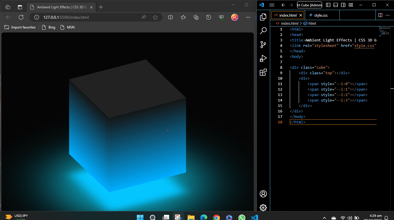
A “CSS 3D Glowing Animated Cube” is a type of web design or web element that is created using Cascading Style Sheets (CSS) to achieve several visual effects:
- 3D: This indicates that the cube has a three-dimensional appearance. In the context of web design, it means that the cube’s sides and angles are manipulated in a way that makes it appear to have depth, similar to a real three-dimensional object.
- Glowing: “Glowing” implies that the cube emits or reflects light in a way that makes it stand out or appear as if it’s illuminated. This effect is often achieved by using gradients, shading, or other CSS techniques to give the cube a glowing or luminous appearance.
- Animated: The cube is not static; it features animations. Animations can include movements, transitions, or transformations of the cube’s elements. These animations can make the cube change shape, color, or position over time, creating an engaging and dynamic visual experience.
- Ambient Light Effects: “Ambient light effects” indicates that the web page incorporates visual effects related to lighting. Ambient light refers to the soft, diffuse, and non-directional light that illuminates an environment.
Html Code
<!DOCTYPE html>
<html>
<head>
    <title>Ambient Light Effects | CSS 3D Glowing Cube Animation Effects</title>
    <link rel="stylesheet" href="style.css">
</head>
<body>
    <div class="cube">
        <div class="top"></div>
        <div>
            <span style="--i:0"></span>
            <span style="--i:1"></span>
            <span style="--i:2"></span>
            <span style="--i:3"></span>
        </div>
    </div>
</body>
</html>
Here’s the explanation of the HTML code step by step:
<!DOCTYPE html>:- This line declares the document type and version of HTML, indicating that this is an HTML5 document.
<html>:- This is the root element of an HTML document, encapsulating all the content within it.
<head>:- This section contains metadata and links to external resources, such as CSS files or scripts.
<title>:- This tag sets the title of the web page, which appears in the browser’s title bar or tab. In this case, it’s set to “Ambient Light Effects | CSS 3D Glowing Cube Animation Effects.”
<link>:- This
<link>element is used to include an external CSS file named “style.css.” Thehrefattribute specifies the path to the CSS file, and it’s used to style the HTML content.
- This
<body>:- The
<body>tag contains the visible content of the web page.
- The
<div class="cube">:- This
<div>element has the class “cube,” and it represents the 3D cube on the web page. It contains the cube’s various faces and animations.
- This
<div class="top">:- Inside the “.cube” div, there is another
<div>with the class “top.” This represents the top face of the cube.
- Inside the “.cube” div, there is another
- Nested
<div>with<span>elements:- Inside the “.cube” div, there is another
<div>that contains four<span>elements.
- Inside the “.cube” div, there is another
<span>elements with custom styles:- Each
<span>element has a custom style attribute (style) with--iset to different values (0, 1, 2, and 3). These custom properties are used to apply specific transformations to these spans later in the CSS.
- Each
The HTML code sets up the structure of the web page. It includes the document title, a link to an external CSS file for styling, and a container (<div class="cube">) representing a 3D cube with various faces. The cube’s top face is represented by a nested <div>, and four <span> elements within the cube will be styled and animated using CSS to create the cube’s appearance and effects.
CSS Code
*{
	margin: 0;
	padding: 0;
	box-sizing: border-box;
}

body{
	display: flex;
	justify-content: center;
	align-items: center;
	min-height: 100vh;
	background: #050505;
}

.cube{
	position: relative;
	width: 300px;
	height: 300px;
	transform-style: preserve-3d;

	animation: animate 4s linear infinite;
}
@keyframes animate
{
	0%
	{
		transform: rotateX(-30deg)  rotateY(0deg);
	}
	100%
	{
		transform: rotateX(-30deg)  rotateY(360deg);
	}
}

.cube div{
	position: absolute;
	top: 0;
	left: 0;
	width: 100%;
	height: 100%;
	transform-style: preserve-3d;

}
.cube div span{
	position:absolute;
	top: 0;
	left: 0;
	width: 100%;
	height: 100%;
	background: linear-gradient(#151515, #00aeff);
	transform: rotateY(calc(90deg * var(--i))) translateZ(150px);
}
.top{
	position: absolute;
	top: 0;
	left: 0;
	width: 300px;
	height: 300px;
	background: #222;
	transform: rotateX(90deg) translateZ(150px);
}
.top::before{
	content: '';
	position: absolute;
	top: 0px;
	left: 0;
	width: 300px;
	height: 300px;
	background: rgb(5, 197, 255);
	transform: translateZ(-380px);
	filter: blur(20px);
	box-shadow: 0 0 120px rgba(0, 108, 141, 0.2),
	0 0 200px rgba(0, 150, 177, 0.4),
	0 0 300px rgba(0, 184, 230, 0.6),
	0 0 400px rgba(10, 232, 248, 0.8),
	0 0 500px rgb(48, 220, 250)
}
Let’s break down this CSS code step by step:
Universal Selector (*):
   * {
       margin: 0;
       padding: 0;
       box-sizing: border-box;
}- The universal selector
*selects all HTML elements on the page. margin: 0;andpadding: 0;are used to reset the margin and padding of all elements to zero. This is often done to provide a consistent starting point for styling across different browsers.box-sizing: border-box;changes the box-sizing model for all elements to “border-box.” This ensures that padding and borders are included within the element’s total width and height, simplifying layout calculations.
Body Styling:
   body {
       display: flex;
       justify-content: center;
       align-items: center;
       min-height: 100vh;
       background: #050505;
}bodyselects the<body>element of the HTML document.display: flex;sets the display property to “flex,” making it a flex container.justify-content: center;centers the content horizontally within the flex container.align-items: center;centers the content vertically within the flex container.min-height: 100vh;sets the minimum height of the body to 100% of the viewport height, ensuring that the content occupies at least the entire viewport height.background: #050505;sets the background color of the body to a dark grayish color (#050505).
Styling for the .cube Class:
   .cube {
       position: relative;
       width: 300px;
       height: 300px;
       transform-style: preserve-3d;
       animation: animate 4s linear infinite;
}.cubeselects elements with the class “cube.”position: relative;sets the position property to “relative.”width: 300px; height: 300px;specifies the width and height of the cube to be 300 pixels, making it a square.transform-style: preserve-3d;enables 3D transformations for the cube and its children.animation: animate 4s linear infinite;applies an animation named “animate” to the cube. The animation lasts for 4 seconds, has a linear timing function, and repeats infinitely.
Animation Keyframes:
   @keyframes animate {
       0% {
           transform: rotateX(-30deg) rotateY(0deg);
       }
       100% {
           transform: rotateX(-30deg) rotateY(360deg);
       }
   }
@keyframes animatedefines a keyframe animation named “animate.”0%represents the starting point of the animation.transform: rotateX(-30deg) rotateY(0deg);specifies that at the beginning (0% progress), the cube is rotated -30 degrees around the X-axis and 0 degrees around the Y-axis.
100%represents the ending point of the animation.transform: rotateX(-30deg) rotateY(360deg);specifies that at the end (100% progress), the cube is rotated -30 degrees around the X-axis and 360 degrees around the Y-axis, completing a full rotation.
Styling for .cube div:
   .cube div {
       position: absolute;
       top: 0;
       left: 0;
       width: 100%;
       height: 100%;
       transform-style: preserve-3d;
   }
.cube divselects the child<div>elements within the.cubeelement.position: absolute;sets the position property to “absolute,” allowing these child divs to be positioned precisely within their parent (.cube).top: 0; left: 0;anchors the child divs to the top-left corner of their parent div.width: 100%; height: 100%;makes these child divs occupy the entire width and height of their parent, effectively covering the entire cube face.transform-style: preserve-3d;enables 3D transformations for these child divs, preserving the 3D context established by the parent.
Styling for .cube div span:
   .cube div span {
       position: absolute;
       top: 0;
       left: 0;
       width: 100%;
       height: 100%;
       background: linear-gradient(#151515, #00aeff);
       transform: rotateY(calc(90deg * var(--i))) translateZ(150px);
   }
.cube div spanselects the<span>elements that are children of the.cube divelements.position: absolute;positions the<span>elements absolutely within their parent.cube div.top: 0; left: 0;anchors the<span>elements to the top-left corner of their parent, ensuring they cover the entire face.width: 100%; height: 100%;makes the<span>elements fill the entire width and height of their parent, covering the cube face.background: linear-gradient(#151515, #00aeff);sets a linear gradient background for the<span>elements, creating a glossy effect with colors transitioning from dark gray (#151515) to light blue (#00aeff).transform: rotateY(calc(90deg * var(--i))) translateZ(150px);applies a 3D transformation to the<span>elements:rotateY(calc(90deg * var(--i)))rotates each<span>element around the Y-axis by a calculated angle based on the custom property--i. This creates the 3D effect.translateZ(150px);translates each<span>element along the Z-axis by 150 pixels, giving depth to the cube faces.
Styling for .top:
   .top {
       position: absolute;
       top: 0;
       left: 0;
       width: 300px;
       height: 300px;
       background: #222;
       transform: rotateX(90deg) translateZ(150px);
}.topselects an element with the class “top.”position: absolute;positions the element absolutely within its parent.top: 0; left: 0;anchors the element to the top-left corner of its parent.width: 300px; height: 300px;sets the width and height of the element to 300 pixels, making it a square.background: #222;gives the element a background color of dark gray (#222).transform: rotateX(90deg) translateZ(150px);applies a 3D transformation to the element:rotateX(90deg)rotates the element around the X-axis by 90 degrees, making it appear as the top face of the cube.translateZ(150px)translates the element along the Z-axis by 150 pixels, moving it away from the viewer and giving it depth within the cube.
Styling for .top::before (Pseudo-Element):
   .top::before {
       content: '';
       position: absolute;
       top: 0px;
       left: 0;
       width: 300px;
       height: 300px;
       background: rgb(5, 197, 255);
       transform: translateZ(-380px);
       filter: blur(20px);
       box-shadow: 0 0 120px rgba(0, 108, 141, 0.2),
                   0 0 200px rgba(0, 150, 177, 0.4),
                   0 0 300px rgba(0, 184, 230, 0.6),
                   0 0 400px rgba(10, 232, 248, 0.8),
                   0 0 500px rgb(48, 220, 250);
}.top::beforeselects the pseudo-element::beforeof the.topelement, allowing you to create an additional element before the top face.content: '';provides an empty content for the pseudo-element (no visible content).position: absolute;positions the pseudo-element absolutely within its parent.top: 0px; left: 0;anchors the pseudo-element to the top-left corner of its parent.width: 300px; height: 300px;sets the width and height of the pseudo-element to 300 pixels, matching the size of the top face.background: rgb(5, 197, 255);gives the pseudo-element a background color using an RGB value, creating a blue background.transform: translateZ(-380px);translates the pseudo-element along the Z-axis by -380 pixels, moving it behind the top face and creating an ambient light effect.filter: blur(20px);applies a 20-pixel blur filter to the pseudo-element, creating a soft, blurred appearance.box-shadow:adds multiple box shadows to the pseudo-element, creating the appearance of ambient light and depth. These shadows have varying colors and blur values.
In summary, this CSS code styles various components of a 3D cube, including its faces, animations, and ambient light effects. It utilizes 3D transformations, colors, gradients, and box shadows to create an engaging and visually striking 3D cube animation with ambient light effects.
Download 3D Animated Cube Full Project
This zip file contains all the HTML and CSS files related to this project.
Download 3D Cube Code
Resource ready for free download! Sign up with your email to get instant access.Just download, extract and run.