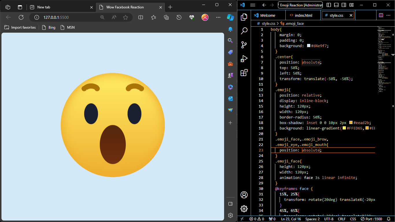
“Facebook Wow Emoji Reaction Using HTML & CSS” is a project or code example that demonstrates how to create an animated emoji reaction similar to the “Wow” reaction emoji commonly used on Facebook. This project utilizes HTML and CSS to design and animate the emoji.
The purpose of this code is to replicate the visual appearance and animation of the “Wow” reaction emoji that users can use to react to posts and content on the Facebook platform. It’s a creative way to learn and showcase how HTML and CSS can be used to create visually engaging and interactive elements on a web page.
Facebook Wow Emoji HTML Code
<!DOCTYPE html>
<html lang="en" dir="ltr">
   <head>
      <meta charset="utf-8">
      <title>Wow Facebook Reaction</title>
      <link rel="stylesheet" href="style.css">
   </head>
   <body>
      <div class="center">
         <div class="emoji">
            <div class="emoji_face">
               <div class="emoji_brow"></div>
               <div class="emoji_eye"></div>
               <div class="emoji_mouth"></div>
            </div>
         </div>
      </div>
   </body>
</html>- The HTML structure consists of an HTML document with a
<head>section and a<body>section. The<head>section includes the document’s title and a reference to an external CSS file named “style.css.” - Inside the
<body>, there’s a<div>element with a class of “center.” Inside this div, there’s another<div>with a class of “emoji.” Within the “emoji” div, there’s a structure representing the face of the emoji, including the face itself, eyebrows, eyes, and mouth.
Emoji CSS Animation
body{
    margin: 0;
    padding: 0;
    background: #d4e9f7;
  }
  .center{
    position: absolute;
    top: 50%;
    left: 50%;
    transform: translate(-50%, -50%);
  }
  .emoji{
    position: relative;
    display: inline-block;
    height: 120px;
    width: 120px;
    border-radius: 50%;
    box-shadow: inset 0 0 10px 2px #eead2b;
    background: linear-gradient(#FFED65,#EEAD2F);
  }
  .emoji_face,.emoji_brow,
  .emoji_eye,.emoji_mouth{
    position: absolute;
  }
  .emoji_face{
    height: 120px;
    width: 120px;
    animation: face 3s linear infinite;
  }
  @keyframes face {
    15%, 25%{
      transform: rotate(20deg) translateX(-20px);
    }
    45%, 65%{
      transform: rotate(-20deg) translateX(20px);
    }
    75%, 100%{
      transform: rotate(0) translateX(0);
    }
  }
  .emoji_brow{
    left: calc(50% - 3px);
    height: 6px;
    width: 6px;
    background: transparent;
    border-radius: 50%;
    box-shadow: -18px 0 0 0 #aa7408,
                -33px 0 0 0 #aa7408,
                 18px 0 0 0 #aa7408,
                 33px 0 0 0 #aa7408;
    animation: eye_brow 3s linear infinite;
  }
  @keyframes eye_brow {
    15%, 65%{
      top: 25px;
    }
    75%, 100%, 0%{
      top: 15px;
    }
  }
  .emoji_brow:before,
  .emoji_brow:after{
    position: absolute;
    content: '';
    left: calc(50% - 12px);
    top: -3px;
    width: 24px;
    height: 20px;
    border: 6px solid #aa7408;
    border-radius: 50%;
    box-sizing: border-box;
    border-bottom-color: transparent;
    border-left-color: transparent;
    border-right-color: transparent;
  }
  .emoji_brow:before{
    margin-left: -25px;
  }
  .emoji_brow:after{
    margin-left: 25px;
  }
  .emoji_eye{
    top: 35px;
    left: calc(50% - 8px);
    height: 24px;
    width: 16px;
    border-radius: 50%;
    background: transparent;
    box-shadow: 25px 0 0 0 #1b2031,
                -25px 0 0 0 #1b2031;
  }
  .emoji_mouth{
    top: 50%;
    left: calc(50% - 15px);
    width: 30px;
    height: 40px;
    border-radius: 50%;
    background: linear-gradient(#54290F,#622B0B,#6E3011);
    animation: mouth 3s linear infinite;
  }
  @keyframes mouth {
    10%, 30%{
      width: 20px;
      height: 20px;
      left: calc(50% - 10px);
    }
    50%, 70%{
      width: 30px;
      height: 40px;
      left: calc(50% - 15px);
    }
    75%, 100%{
      height: 45px;
    }
  }
Download Full Project
Resource ready for free download! Sign up with your email to get instant access.- The CSS code begins with a reset for the margin and padding of the
bodyand sets a light blue background color. - The
.centerclass is used to center-align the emoji on the page using the CSSpositionandtransformproperties. - The
.emojiclass is used to style the circular emoji container, giving it a border-radius, box-shadow, and a linear gradient background. - There are animation keyframes defined for the face, eyebrows, and mouth using
@keyframes. These keyframes define animations such as rotation, translation, and changes in width and height for various parts of the emoji. - Styles for the emoji’s face, eyebrows, eyes, and mouth are defined, setting their positions, sizes, and appearances.
- The CSS for the emoji’s eyebrows, eyes, and mouth also includes animation keyframes for their respective animations.
This code essentially creates a visually appealing animated “Wow” emoji that mimics the Facebook reaction emoji. The animation keyframes provide the movement and expression changes for different parts of the emoji’s face.


